How to copy an animation from a website
The one thing a screenshot can never give you. Here is how to read the duration, the easing curve and the keyframes off a live page — including animations no CSS file describes.
Open DevTools, go to the Animations panel and record while the animation fires. It lists what ran and for how long. For a transition, read transition-duration and transition-timing-function in the Styles panel; for a keyframe animation, search the stylesheet for the animation name. For anything built in JavaScript, run element.getAnimations() in the console — it returns the timing and the keyframes the browser is actually running.
Why animations are harder to copy than layouts
A layout sits still and lets you measure it. An animation is over in 300 milliseconds, and the three things that define it are all invisible in a still frame:
- Duration — how long, in milliseconds.
- The easing curve — how the value moves through that time. This is what makes motion feel snappy, heavy or springy, and it is the part people skip.
- The keyframes — what actually changes, and at which points.
Then there is the trigger: hover, scroll, load, or a state change. Same animation, different trigger, different thing entirely.
1. Find what is animating
Open DevTools, then the Animations panel (in the drawer, under the three-dot menu → More tools). Hit record and make the animation happen. Every animation that fires shows up as a bar on a timeline, with its element and its duration.
The panel also lets you slow playback to 25% or 10%, which is the fastest way to see what is actually moving when several things fire at once.
2. Read the timing and the curve
For a CSS transition, the Styles panel has everything:
transition-property: background-color, transform;
transition-duration: 220ms;
transition-timing-function: cubic-bezier(0.34, 1.56, 0.64, 1);
transition-delay: 0s;
That cubic-bezier with a second value above 1 is a spring — it overshoots the target and settles back. Copy the duration without it and your version will feel flat, at exactly the right speed.
For a keyframe animation, the shorthand carries the same information: animation: spin 1.4s linear infinite.
3. Get the keyframes
The animation name points at a block somewhere in the stylesheet:
@keyframes float {
  0%   { transform: translateY(0); }
  50%  { transform: translateY(-8px); }
  100% { transform: translateY(0); }
}
Find it with the search in the Sources panel. When the stylesheet comes from another domain and cannot be read as text — common on any site with a CDN — go around it:
$0.getAnimations().map(a => ({
  name: a.animationName,
  timing: a.effect.getComputedTiming(),
  frames: a.effect.getKeyframes()
}))
With an element selected in the Elements panel, $0 is that element. This reports what the browser is running, whatever its source.
4. Check the trigger
Worth a moment, because it is the most common reason a faithful copy feels wrong. Ask:
- Does it run on hover? Then it is a transition on a state, and it needs a reverse — which often has a different duration from the way in.
- Does it run on load, once? Then it needs
animation-fill-modeso it holds its end state. - Does it run on scroll? Then there is no duration at all — the timeline is the scroll position.
- Does it loop? Note the iteration count and the direction;
alternatelooks very different from restarting.
The JavaScript case
A growing share of the motion you want to copy is not in any stylesheet. GSAP, Motion, Framer Motion and hand-written code all drive the Web Animations API, which means the animation exists on the element with no CSS describing it.
getAnimations() is the answer, and it is genuinely complete: the timing, the iterations, the direction, and the computed keyframes. A tool that only reads stylesheets will tell you there is no animation on an element that is visibly moving.
The shortcut
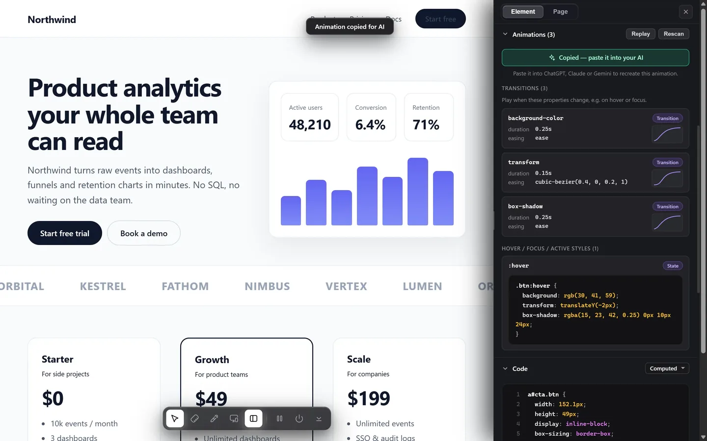
All of the above is four panels and a console. Design Toolkit does it in one: select an element and the animation section lists its transitions with their durations and curves, the CSS animations with their keyframes, and anything running through the Web Animations API — with the easing drawn as a curve so you can see the spring rather than parse the numbers. There is a copy button that writes the whole thing out as a brief for an AI, or sends it straight to a coding agent, which is the fastest path from "I like that" to "it is in my project".
If you are rebuilding a whole component rather than one animation, giving your AI the real design covers the same idea for everything else on the element.
Read motion, not just styles
Durations, easing curves, keyframes and JavaScript animations — in one panel, with a copy button for your AI. Free for 7 days.
Add to Chrome — free trialCommon questions
Why does my copy feel wrong even with the right duration?
Almost always the easing. 300ms on ease-out and 300ms on cubic-bezier(0.34, 1.56, 0.64, 1) are different animations — the second overshoots and settles back. Duration sets how long; the curve sets how it feels.
How do I read an animation made with GSAP or Motion?
Those libraries drive the Web Animations API, so the animation exists on the element with no CSS describing it. element.getAnimations() returns it with its timing and keyframes.
Can I copy an animation from a site whose CSS I cannot read?
Yes. A cross-origin stylesheet cannot be read as text, but the animation the browser is running can still be inspected through getAnimations, which reports the computed keyframes regardless of source.
What about scroll-driven animations?
A scroll-driven animation has no duration in seconds — its timeline is the scroll position. Note the timeline and the keyframes rather than a duration, and rebuild it with scroll-timeline or an intersection observer.