How to get Tailwind classes from a website
There are two different problems hiding in this question: the site already uses Tailwind and you want its classes, or it does not and you want its design written as Tailwind. Here are three ways to get there.
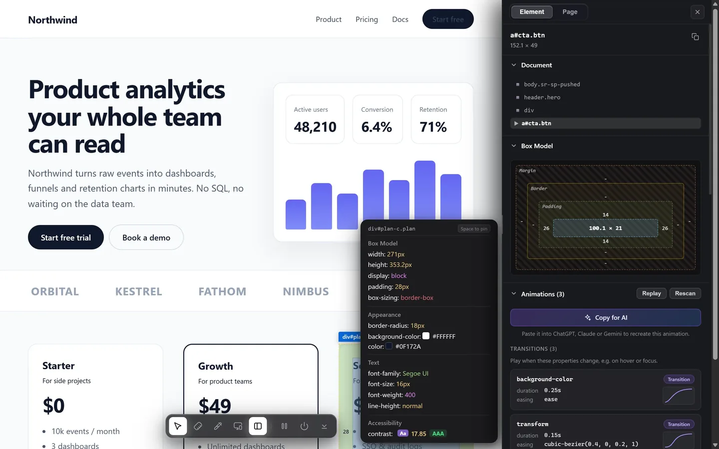
If the site is built with Tailwind, the classes are in the markup: select the element in DevTools and read its class attribute. If it is not, you need the element’s computed CSS translated into utilities. With Design Toolkit, select the element and use the code export in the side panel to copy it as Tailwind classes, or copy a whole section as Tailwind.
1. Find out whether the site uses Tailwind
Select an element in the Elements panel and look at its class attribute. Tailwind sites have a recognizable look:
- Long lists of short utility classes:
flex items-center gap-4 px-6 py-3 rounded-lg. - Responsive and state prefixes:
md:grid-cols-3,hover:bg-neutral-100,dark:text-white. - Bracketed arbitrary values:
w-[232px],text-[#111111].
If you see readable component names instead, such as .card or .hero-title, the site writes its own CSS or uses a different framework, and you are in the next section.
2. If it does, read the classes
Then the class attribute is the answer, including the prefixes. Copy it from the Elements panel with Copy → Copy element or select the class value directly. Two things to keep in mind:
- Their config is not in the markup. A class such as
text-brandorbg-primarypoints at a color that site defined itself. Read the computed color and define the same name in yours. - Their version matters. Tailwind v4 reads its theme from CSS variables, while v3 reads it from a config file, so a custom value is declared in a different place.
3. If it does not, translate the CSS
Read the element's values in the Computed tab and map them onto Tailwind's scales. These are the defaults:
| CSS | Tailwind |
|---|---|
padding: 16px | p-4 (the scale is 4px per step: p-5 is 20px, p-6 is 24px, p-8 is 32px) |
gap: 16px | gap-4 |
border-radius: 12px | rounded-xl (8px is rounded-lg, 16px is rounded-2xl, 24px is rounded-3xl) |
font-size: 18px | text-lg (14px is text-sm, 16px text-base, 20px text-xl, 24px text-2xl, 48px text-5xl) |
font-weight: 600 | font-semibold (500 is font-medium, 700 is font-bold) |
display: flex; align-items: center | flex items-center |
When a value is not on the scale, write it as an arbitrary value in square brackets instead of rounding it: w-[232px], rounded-[20px], text-[#111111]. Rounding to the nearest step is how a copy drifts.
Add the states and the widths as prefixes: the hover rule becomes hover:, a rule inside @media (min-width: 768px) becomes md:, and anything at a width Tailwind has no name for becomes min-[900px]:.
4. Or export it
Doing that for one element is fine. Doing it for a hero with thirty elements is the afternoon you wanted to avoid. Design Toolkit reads the computed styles and writes them out for you:
- One element. Select it, open the side panel with O, and copy its code as Tailwind classes, CSS or a React style object.
- A whole section. Select the section and use the Export card: choose Tailwind, check the preview at phone, tablet and desktop widths, then copy or download it. The guide to copying a section covers the details and the limits.
Check it before you trust it
- Compare at three widths. A copy that matches at desktop and drifts at tablet is missing a breakpoint prefix.
- Check the hover states. They are separate rules and they are the easiest thing to lose.
- Check fonts. Tailwind classes name a family, not the file. The font still has to load in your project.
Use what you copy well
A site's design belongs to its makers. Use what you read as a reference, to learn how it was built or to rebuild your own page, and not to publish someone else's work as yours.
Turn any element into Tailwind
Select an element or a whole section and copy it as Tailwind classes. Free for 7 days.
Add to Chrome — free trialCommon questions
How can I tell whether a website uses Tailwind?
Look at an element’s class attribute. Long lists of short utilities such as flex items-center gap-4 px-6, responsive prefixes such as md: and bracketed values such as w-[232px] point to Tailwind. Readable component names such as .card point to hand-written CSS.
Why do some values come out as w-[232px]?
Tailwind has no class for every value. An exact value that is not on the scale is written as an arbitrary value in square brackets, which keeps the copy accurate instead of rounding it to the nearest step.
Can I get Tailwind classes for a whole section at once?
Yes. Select the section, open the Export card in the side panel and choose Tailwind. The preview shows it at phone, tablet and desktop widths before you copy it.
Does this work for Tailwind v3 and v4?
The utility classes themselves are the same in both. What differs is where custom values are declared: v4 reads its theme from CSS variables and v3 from a config file, so declare any custom color or font in the place your version expects.